
Is JavaScript Good For Data Visualization?

Effectively representing data visually compellingly that enables easy data analysis and interpretation is a critical task in data visualization. For many, the road to executing this task is through JavaScript charts or JavaScript chart libraries. And it’s easy to see why.
JavaScript chart libraries are becoming rampant. JavaScript is one of the most popular client-side and server-side programming languages.
Whether browsing through a website or using the features of an application, there’s a very high chance you’re interacting with a few JavaScript elements.
This is because JavaScript has been the go-to programming language for building web applications and implementing client-side interactivity.
Depending on your project needs, JavaScript has a wide array of uses. However, in data visualization, JavaScript is a popular tool for creating interactive models that you can share in a visually engaging manner. For example, using JavaScript, you can tell your data’s stories with moving images or 3D models.
Be that as it may, JavaScript’s popularity and applications aren’t what make it suitable for data visualization. Plus, just because many use JavaScript doesn’t mean you should.
What then is the answer to this grueling question? Is JavaScript an excellent tool for data visualization? Read on to find out.
What is Data Visualization?
Let’s take a step back to discuss the data science pipeline to understand data visualization better. Data science is the science of processing raw data using different methods, such as statistical analysis and machine learning, to arrive at simplified and understandable pieces of information.
This set of methods converts raw data into more meaningful chunks and is known as the data science pipeline.
Raw data undergo different stages within this pipeline, the third of which is data visualization. After data collection and scrubbing, you must interpret your data; identify trends and outliers that’ll lead to business values. This is where data visualization is crucial.
Data visualization is the representation of raw data, using tools such as charts, graphs, and maps, to make it easier for the human brain to comprehend.
This way, your users and stakeholders can easily pull insights, infer values, and make data-driven decisions. Data visualization is particularly essential for analyzing large data sets.
This is because you can easily convert large amounts of data into easy-to-understand charts, maps, graphs, and 3D models.
Why is Data Visualization Important in This Modern Era?
In today’s fast-paced era of constantly changing market conditions and customer expectations, businesses must innovate to remain competitive in any market.
This involves continuously using business data, predicting trends, and making data-driven decisions. Data visualization helps businesses achieve all this.
What’s more, in the modern business era, agility is the game’s name. In other words, quickly predicting trends and inferring business values are crucial in today’s business world.
Data visualization is a quick and effective method of statistical communication. Therefore, you can leverage data visualization tools to identify patterns and trends and become more agile quickly.
However, your bottom line (ROI) is most important in business. So how can data visualization affect your bottom line? Quickly identifying patterns and predicting trends makes for faster and more informed decision-making processes.
And faster decision-making means a shorter market time, ultimately boosting your bottom line.
What Is The Role of Charts, Graphs, and Maps in Data Visualization?
Charts, graphs, and maps are the most popular tools for visualizing large data sets. Charts or graphs can help you identify the relationship between two or more variables, depending on your chart type.
It can tell you how one variable impacts the whole or what data values skew from what you know as the norm.
On the other hand, maps display geographically related data. They can help you compare different regions or geographical locations.
With maps, you understand how one variable change affects your various regions or product distribution in each region. Maps can also show sales and profits in your areas or warehouse distribution to enhance your supply chain.
JavaScript charts and maps have no limitations depending on your data visualization goals. So, define your goals and identify what would help you achieve them.
What Are JavaScript Charts, and How Do They Support Effective Data Visualizations?
JavaScript charts become imperative when analyzing and presenting significant data points in easy-to-understand forms to benefit an organization or goal.
Typically, businesses leverage data visualization to enable stakeholders to access and assimilate data quickly. They can easily generate insight and convert it into valuable knowledge. But what about the JavaScript aspect?
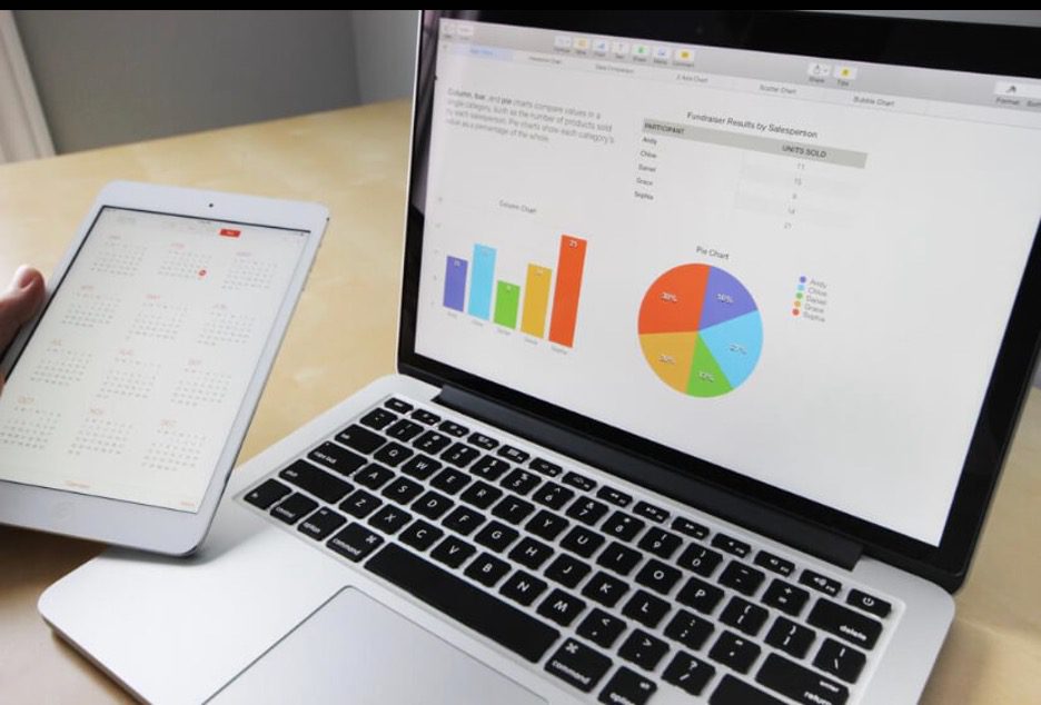
JavaScript charts combine multiple chart types (that remain easy to understand) to deliver a highly visual interface for a fluid client-side interaction. Examples of these chart types include:
- 2D and 3D charts (also known as XY and XYZ charts)
- Line charts
- Bar charts
- Pie charts
- Polar charts
As web browsers enhance their native JS language capabilities, JavaScript charts become more critical as they become fully interoperable with, in a nutshell, the entire internet.
However, it’s not just the popularity of the native language that’s driving up demand for JavaScript charts; it’s also the growing desire for web-based data visualization solutions. Plus, JavaScript’s client-side interactivity.
The ability to implement natural user-action features like pin to zoom, scrolling, panning, or clicking.
What Are Some Examples Of JavaScript Chart Libraries?
There are numerous JavaScript chart libraries out there. Each with unique functionalities and features, built to satisfy specific user needs. Here are a few examples of the most popular JavaScript chart libraries in the market today:
- FusionCharts
- D3.js
- Chart.js
- Google charts
- HighCharts
- Recharts
Are JavaScript Charts Good For Data Visualization?
In 2018, TensorFlow added JavaScript to its list of supported languages. At the time, this move came as quite a surprise to many data enthusiasts.
However, as data science continuously slides into development and design, JavaScript has become a strong data science programming language, particularly in data visualization.
JavaScript is known for its client-side interactivity and aesthetics when creating websites and applications. These attributes are specifically valuable for data visualization. For example, with JavaScript charts, you can quickly represent raw data aesthetically and visually compellingly.